Wiz is an insurance company. Its biggest triumph was an exclusivity to work inside Caixa Econômica's (the largest 100% government-owned financial institution in Latin America) branches. The process of acquiring insurance has many steps. Through these steps, different wiz's employees work handling various pieces of information. Our mission was to design a modular dashboard that could fit the need of all these professionals. This dashboard would work like the home page of all the Wiz users.
The project was designed with Wiz's employees in mind. We couldn't tackle all the roles inside the company. We focused on five big categories and then produced personas based on them.
This project was done by Ana Couto Design. My role was strictly in the UX.
The first step was to talk with the stakeholders. Understanding how they saw the project, what KPIs and guidelines were important. Leadership was one of the categories of users that we were designing. It was essential to understand their working process and their pains too. We continued to interview people from different areas and positions in the company; always trying to understand:
their needs,
their process,
the various software they use,
If the employee worked inside the branches, his best tactics to sell insurance
Always keeping in mind: "what is the 20% more valuable information that will bring 80% of return?."
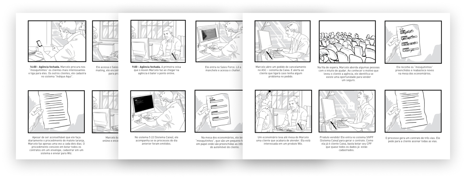
During the interviews, we started to document the operation of the workers. At the end of a new interview, we showed them our notes to check if everything was correct.

Storyboard
We decided to make these notes in a storyboard format, like a comics strip. With the drawing, it was easier for them to visualize and discuss emotions like "frustrated."
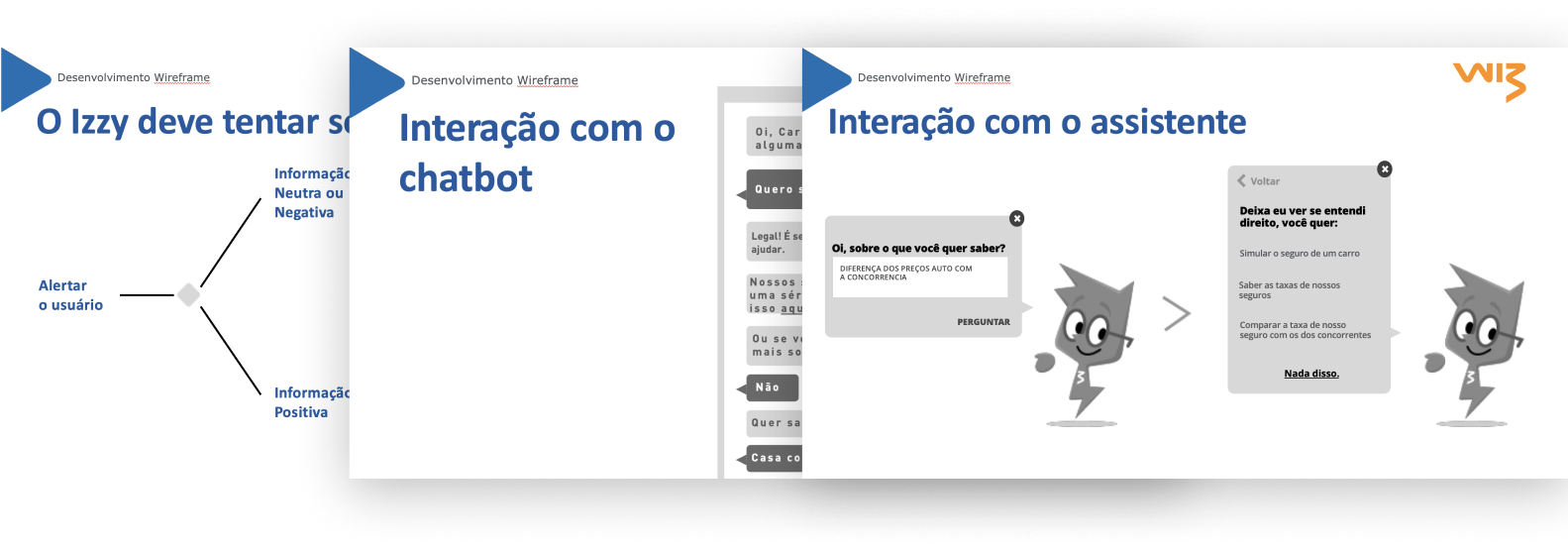
Parallel to this project, Wiz was developing in-house a conversation Bot. Alongside the project, we delivered a document with:
- Insights that we found in the interview that the bot could answer
- Wireframes how the interaction with the bot could work
- Examples of how he can communicate respecting the brand guidelines

After discussing with the users, it was easier to understand what was this 20%. We were able to learn parts of the process that causes issues of communication and methodologies that were implemented but not fully adopted by the team. We started an open dialogue with the stakeholder about what we were going to prioritize. In some cases, we decided on a feature that we knew was very important for the users. In others, we prioritize a feature that was not fully adopted (like the open support tickets on a kanban board).


Wireframes
Wiz, a company that sells insurance, contact us to make a dashboard that could work with all their different employes. We did a series of interviews to dissect their process and what was essential for them too. With a well-documented process, we were able to discuss and create several dashboards based on the needs of various roles inside Wiz.